Welcome all Readers, Comic book enthusiast,
and lost online surfers! This week I had the honor of visiting the Jack Kirby
exhibit in the CSUN art gallery and see for myself original art, printed
comics, photographs, and more from Kirby’s career. If you’ve ever read an
X-men, Thor, Hulk, or Fantastic four comic then you’re likely familiar with the
creative genius. Although my contribution to this blog is predominately focused
on green lanterns and their villains, the overall purpose is discuss the role
of villains and super heroes and what they add to the plot both individually
and collectively. As I wandered the exhibit I came across a comic book cover that
reminded me of the blog. I felt obligated to share because I takes great talent
to portray a villain as a three dimensional character in just a picture since
so many comic creators are incapable of doing so with words.
As I’ve mentioned numerous times in
my previous post, a superhero and villain are equally important to the plot. Villains
don’t solely exist as some foe for heroes to vanquish, a villain is meant to
challenge the hero and push that protagonist beyond his limits. In most
successful comic books and movies, there is a balance in the opposing
characters and they have an equally alluring and moving back story that motivates
them to behave the way they do. In the Thor #155 comic book cover this balance
of characters is evidently displayed through the use of lines and shapes,
contrast of pointed and curved images, picture placement, dark back drop, and
sizing.
In her book, Picture this, Molly
Bang’s maintains that lines and shapes are capable of implying feelings. Horizontal
shapes give a sense of stability, vertical shapes imply excitement and energy, and
diagonals convey tension. If this is true, which I think it is, I am able to
get a sense on tension and high energy between the two opposing characters. According
to these findings, the diagonal tilt in Thor’s arm and Mangog’s shoulders imply
that there is obvious tension between the two. Rather than feeling that Thor’s intentions
are purely to hurt Mangog, the tension in his arm seems as though he is
resistant to hurt him. It seems that while he does want to protect Odin he is
hesitant. I would assume that this is because not only does Thor fear Mangog
but he also seems to want to understand him. Mangog is the very embodiment of
an entire race that once fought Asgard, Odin killed off the race and trapped
their combined hate into Mangog body. When looking at the character placement on
the cover, it seems as though Jack Kirby intended for Mangog to be the focal
point rather than the battle itself.
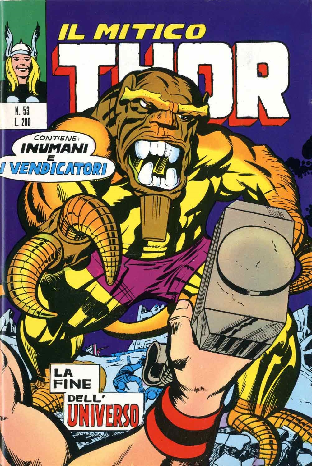 While Mangog being the center and much
larger image on this cover implies that he is stronger and more important,
Kirby restores balance by placing Thor’s energetic upward hand in front of Mangog.
In Bang view, images that overlap “pierce or violate the space of the other,
but this also joins them together into a single unit” (86). In other words, the
placement of Thor’s hand makes Mangog slightly vulnerable and less intense. This
could possibly be because in the story Mangog does not intend to destroy
everything but instead seeks revenge on Odin. Thor is not who Mangog is after
but he is in danger because he stands in his way, you can get a sense of this
danger by looking at Thor’s hand on the bottom corner on the cover.
While Mangog being the center and much
larger image on this cover implies that he is stronger and more important,
Kirby restores balance by placing Thor’s energetic upward hand in front of Mangog.
In Bang view, images that overlap “pierce or violate the space of the other,
but this also joins them together into a single unit” (86). In other words, the
placement of Thor’s hand makes Mangog slightly vulnerable and less intense. This
could possibly be because in the story Mangog does not intend to destroy
everything but instead seeks revenge on Odin. Thor is not who Mangog is after
but he is in danger because he stands in his way, you can get a sense of this
danger by looking at Thor’s hand on the bottom corner on the cover.
This
image seems to be more focused on Mangog himself rather than a battle between a
hero and a villain. As we just previously established, the characters are
currently balanced in importance however Mangog’s character is more intimidating
and alluring. As the obviously larger and stronger opponent in this battle,
Mangog is a brighter hue placed on a darker backdrop. As the purple in the back
implies danger and vulnerability like being unable to see in the night sky, its
contrast with Mangog’s yellow surface forces us to focus on Mangog while the
back fades away as a minor detail. Kirby seems as though he is trying to
emphasize the importance of Mangog not as a scary villain but an intimidating character
with a story worth listening to. Kirby chose to round off all of the villain’s
edges making him in a way softer but managed to still portray him as a threat
by emphasizing on placement, color, shape direction, and size.
No comments:
Post a Comment